Christian Schwartz on Type Design

SHARE


 Typefaces, or fonts, are powerful tools that color the voice of our written words. Almost everyone uses fonts. Average PC users choose from the selection pre-installed fonts on their computers to add expressiveness to a greeting card or presentation. Graphic designers select from small libraries of purchased commercial fonts to create websites, brochures and company identities. Editorial and corporate art directors commission large, exclusive-use type families to standardize their organizations’ entire visual identity system.
Christian Schwartz is a New York-based type designer who regularly works with this last group. He has designed custom typefaces for clients like The Guardian, Bosche, and Deutsche Bahn. In 2005, Esquire magazine commissioned the design of Stag, a unique serif type family for headlines. Stag was released for retail purchase in 2007.
A lot of your retail typefaces started out as commissions. What happens one of these controlled environment experiments gets released into the wild?
It’s fantastic. I love to see things used in surprising ways. Just think about Bell Centennial. That was drawn for tiny listings in a phone book, and then in the 1990s Rolling Stone blew it up to 800 points, until you could see the ink traps that made it work at its intended size on its intended paper. It’s really interesting to see these details taken out of context and exposed.
I can’t wait to see what people do to the Guardian family, when it’s released later this year. There may be a handful of magazines and newspapers who buy it so they can look like the Guardian, but I’m hoping that, like Times New Roman, it’ll have a life way beyond the paper it was designed for.
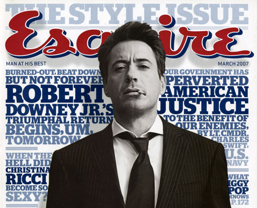
When you released Stag as a retail font, you wrote that Esquire was really pushing you to be weird. Why were they doing that and how did you react?
They wanted weird because they were going to do really weird stuff with it. It was important to stand out from Maxim, GQ, and Details, while looking cooler and feeling like Esquire.
When I’ve done typefaces for corporate clients like Bosche and Deutche Bahn, usually they want what they already have or what the identity consultant used as a placeholder. These corporate projects are rarely driven by creativity. They’re driven by licensing so that they can have a thousand seats. They’re happy to pay the production fee because it comes with a license and they don’t have to pay the huge price it costs to get a retail license for that many computers.
So a custom face actually ends up cheaper for them than if they had bought something off the shelf?
In the case of the Deutche Bahn, yes. They’re the 2nd largest corporation in Europe with many different components. You’ve got internal corporate communications, signage, schedules, all the online stuff, advertising print, etc. You’re looking at thousands of people who will have to use that typeface. And if you pay to have it drawn, you can have it made exactly to your specs.
But with a publication, it’s also branding. If you see a third of a page ripped off next to you on a tube, you should be able to tell it’s the Guardian, even if the name is nowhere to be found, because it feels and sounds like the Guardian and has the Guardian’s voice.

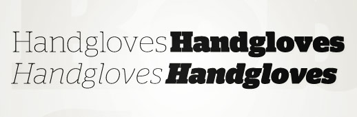
Was there a defining weight for the type family?
Absolutely yes! It’s the black, because that’s why Esquire called me and where we started. They said “we want to use a lot of ink: huge, bold headlines”. Everything else grew from there to make it usable.
That doesn’t surprise me because Stag’s black is a stand out, but so is the Ultra Thin.
Well, the Ultra Thin was hilarious. They said “We love the black, and we need the medium for the front-of-book stuff, but can you do an Ultra Thin and still make it look like Stag? My first thought was no. I was concerned about there being a contrast between the serifs on the inside having no bracketing, and the serifs on the outside having rounded bracketing. The aim there was to make the spaces between the letters as interesting as the spaces inside. By leaving those brackets so that they added weight, which made the thin intentionally spotty.
I started Stag while we were putting the final touches on Guardian Egyptian, so the timing couldn’t be worse. I was all slabbed out. But I liked the creative team at Esquire, so I didn’t want to leave them hanging. But there were quite a few design decisions that were made to keep it away from Guardian Egyptian.
Looking at Stag, I noticed that the lowercase italic is really different than the Roman, but the uppercase just looks slanted.
Yeah, the uppercase is essentiallly a corrected oblique. The uppercase provides a good hook to matching with the Roman. There have been many attempts to draw uppercase italics that are as different as the lowercase, but they are usually too bizarre and unusable. People only have a certain tolerance for weirdness.
I don’t like when type is trying too hard to be interesting or cool or new, so I usually try to be natural in my approach, but with Stag’s italic lowercase, Esquire wanted another voice to add to their palette without adding a whole new family.
After you’ve done your first round of sketches and you’re ready to show them your work, how do you “sell” these ideas to clients?
I don’t talk a whole lot in the first meeting. I sit back and absorb. Discussions with magazines can be driven by neurosis and stream of consciousness. “We don’t quite compete with this magazine, but we don’t want to look like them because this person I used to work with is there now.” It’s like keeping track of football: I have to remember who’s been traded and who’s fueding with who. I try to air all that out in the beginning.
A big part of it is also forming a common vocabulary, because most clients are not used to talking about type.
So what do you talk about then?
I feel them out and see what I can use, whether it’s film or music or fashion or other kinds of design. Roger Black talks in very strange terms: “it needs to look like a Paris bistro, 14th Arrondissement 1942. I’ve gotta go, talk to you later.” My job is to figure out what the hell he’s talking about.
Before I start drawing anything, I show them a lot of type. This probably makes me a terrible businessman, but anytime someone asks me for a custom typeface, I try to talk them out of it because there are so many good typefaces out there already that there may be something out there that’s perfect for them that they just don’t know about.
Once those are exhausted, I’ll dig up some historical specimens. A big part of Stag came from this obscure, heavy Egyptian from a 1922 Deberny et Peignot catalog. It was just a couple words, but I asked them “How do you guys like this? How do you feel about these curves, are they too boxy? are they too round? is it masculine enough? is it too soft?” So by the time I do a sketch, I’ve have gotten pretty close to understanding what they want.
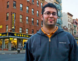
So how long have you been in New York now?
Almost six years.
Is there something “New York” about your design?
I’m definitely influenced by being able to pick up almost any magazine in the world and see what they’re doing with design. There are weeks that go by that I don’t leave a four block radius of my apartment. Everything I need is in my neighborhood. Great groceries, magazine shop not too far away. I don’t shop for a lot of clothes. And now there’s a Muji here which I can get to in 5 minutes.
Do you look at many Japanese magazines?
I used to look at it more. Japanese magazine design seems to move a little slower. The Japanese magazines I”m looking at now look very much like the ones I was looking five years ago. But I love the diagramic way that things are layed out. You got the picture of the guy in his outfit and then you have each individual item photographed separately. There’s an information design aethetic to it that I really like.
It makes American or European magazines look more cryptic and almost useless. It’s as if they’re selling the idea of fashion more than the items themselves.
I think they’re selling a particular attitude that is changing just a little bit each season. “Fall 2006 has more energy, spring 2007, that’s more laid back.”
 A lot of the fashionable typefaces from America never make it to Japan, so coming back to New York, the typefaces I see on the street are very different. I was surprised to see so much Neutraface. I knew it was doing well, but it’s on every other city block.
Right. On construction barriers, for a new luxury condominium building. It’s actually a little depressing actually. I didn’t draw Neutraface to be a best seller. I took the source material and did what felt right. Honestly, I thought it was going to be a minor seller that would show up here and there anytime someone wanted Art Deco. Then in the first year, it showed up at the Oscars and took off from there.
Do you know why?
I guess it was the right moment for it. The 2000s have been dominated by an insatiable demand for new sans serifs, and I guess it was just normal enough and just different enough.
When Emigre released Mrs. Eaves, every fan of Emigre bought it because they had been aching for years for an Emigre typeface their boss would let them use. And there was Mrs. Eaves on a silver platter. It’s Baskerville but it’s Emigre. I think Neutraface was the same. It’s House Industries being serious, a House font that you could buy and your boss would let you use. There’s only so much you could do with the Rat Fink fonts.
Where did Neutraface 2 come from?
Well, the original Neutraface says 1933. I’ve seen uses that transcend that, but it’s difficult to do because those low crossbars put it in a specific time and place.
I was tired of seeing those low crossbars everywhere and I had wanted to do a normalized version of it. But initially House was worried that it would undercut the concept, but I was seeing graphic designers clumsily modify it for logos and catalogs. I figured if other people were going to do it, I might as well do it myself, the way I’d like it and make it easy for these designers.
—
More of Christian’s work can be found on his homepage, and many of Christian’s typefaces can be purchased at Village, Font Bureau and FontFont.
For those of you who would like to see the man in person and ask him questions, he will be the guest at the next TAB Talks #4 on April 8.


Chris Palmieri
Chris Palmieri
SHARE