Branding the Mid-Century
This exhibition makes a compelling case for the aesthetic of the mid 20th century. The one hundred or so works on display are unabashedly two-dimensional, relying on simple geometric silhouettes and basic colors to make their appeal. Though now, rather than peaking my interest in a new camera, they have me buying into an image of less cluttered times.
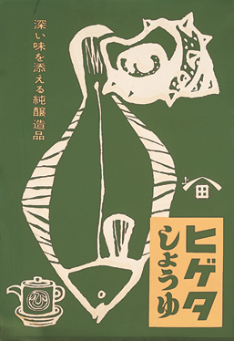
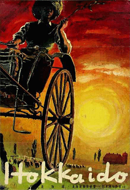
With almost no copy, the pieces, mostly advertising posters but also magazine covers and package designs, are, well, graphic. Compared to today’s emphasis on information and cleverness these examples of days gone by seem to lean closer to art than advertising. Though to be fair to the contemporary era, it is unlikely that a retrospective of Japanese turn-of-the-millennium graphic design would reflect the cacophonic reality that is the Tokyo subway.
The exhibition does, however, begin with a selection of posters taken from a public context, primarily ads for household products. Here we can see the half-century-old graphic rendition of the pleasure of a cold beer, the ease of a pre-shrunk blouse, and the pictorial imaginings of a modern, international lifestyle circa 1950 — a delightful vocabulary of refrigerators, sausages, and parrots.
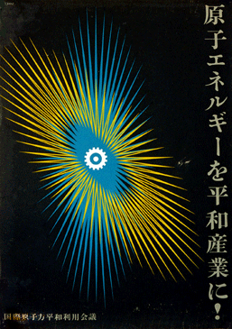
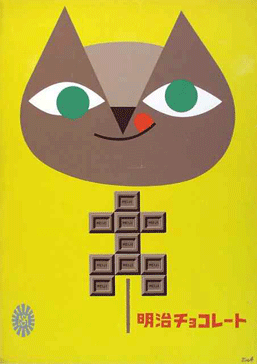
More than a few well-known brands, such as Asahi Beer and Meiji Chocolate, exemplify the anticipated tension between traditional and modern in postwar, occupied Japan. There is plenty of cardinal red and indigo but even more sunny yellow and sky blue, and while characters haven’t taken over yet, some of those Meiji ads are damn cute. Note to advertisers: invest in talented artists and ensure that your brand gets additional visibility at future design retrospectives.
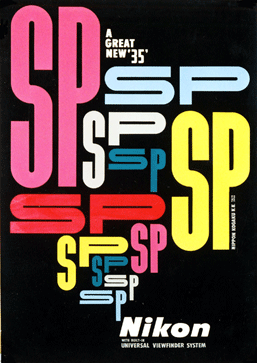
Next, the exhibit delves more into the world of graphic design itself, with a look at different contexts (like designs for cultural activities) and media (like wrapping paper and book covers). While technique is not a major topic, a brief display of the tools of the time serves as a greater reminder than the designs themselves of how the times have changed. And speaking of times, as the accompanying text explains, the 1950s was a time of real growth in the demand for graphic designers, as the transition into an era of increasing consumer products led to, as in the West, an increase in the number of advertisements and packages to be designed.
The exhibition also demonstrates that graphic designers have long been recognized in Japan, which made me wonder to what extent this has shored up Japan’s position as an international star in the field today. A section covers the “Graphic 55” exhibition, held in 1955 at the Takashimaya department store in Nihombashi. This exhibition within an exhibition features the works of eight leading designers of the day, and along with another selection of award-winning works from the Japanese Ad Artists’ Club, presents a neat context for the retrospectively arranged works in the opening section.
Should you finish the exhibition wondering what a collection of current designs might look like, the Printing Museum’s response to that is the 2008 edition of the Graphic Trial. This 3rd edition of the annual invitation of four noteworthy designers to experiment technically around a theme, in this case “execution of beauty,” with both their final works and works in progress on display in a separate (free!) gallery.
Rebecca Milner
Rebecca Milner


