18-1660 or 16-6340 TPX?
SHARE


When the legendry apple fell on Newton’s head, was there a moment where he pondered what colour it was? Was it a green one, a red one, or even a greenish-red one? When one imagines it, perhaps the colour isn’t as relevant as the act itself—why then, should we pay attention to colours? Cue a temporary exhibition at the Sai-No-Kuni Visual Plaza in Saitama precariously inviting us to “Dance with Colors!”
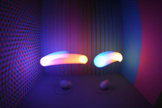
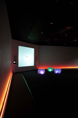
Entering a large dimmed space, I was received as if I had just entered a corporate showroom. Two museum staff instructed me in Japanese, motioning me towards a large screen with three translucent plastic air-filled bags (reminiscent of bean bags) sitting in front of it. As I watched, the two museum staff jubilantly bounced up and down on the seats- each bounce changing the colour of the bags. I joined in the fun and it was then that I noticed the large screen was mimicking our bouncing in three different patterns.
Produced by the design studio “Mongoose”, and aptly called “Fuwapica” (a hybrid of the Japanese words for “soft” [fuwa-fuwa] and “flashily” [pika-pika]) these bags or “communication stools” react to a change in air pressure when someone sits on them, changing the colour of the indirect light that they emit. “Fuwapica” connects a person’s sense of colour with their sense of touch, but isn’t little more than a few minutes of harmless fun? If I am honest, it wasn’t long before I got up from my seat.
Yet, if the “Fuwapica” can be forgiven for “show-ponying”, the Sony BRAVIA M1 and X7000 Series LCD television sets cannot. Like Apple’s attempts to make the first i-Macs aesthetically different, the televisions show a range of ghastly bright colours seemed to point towards a luxurious world with an unlimited range of choice and equally lots of money. They were impressively thin televisions (only 3mm thick) but inevitably, their inclusion felt like a promotion stand inside Yodobashi Camera. This was clearly design but was it celebrating the design or subconsciously selling it?
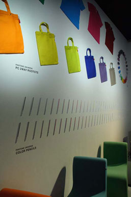
Pantone’s inclusion also speaks volumes of this exhibition’s industrial overtones. As the world’s most renowned authority for reproducing, coordinating, and categorizing colours accurately, their “official” colours have adorned consumer products from diaries to cell-phones. We can now choose a cell phone from their range of millions of colors. I could, for instance, have a cell phone in today’s colour of the day: “Lilly Green,” or the more formal “Pantone 13-0317”. However, whilst Sir Isaac Newton made great attempts to show that white light was heterogeneous, made up of different colours, Pantone take that a step further, not only isolating each colour but also labeling and classifying each subtle change in gradation. Knowing that the company maintains intellectual rights of these labeled colours, we are essentially seeing colours becoming the products of a brand.
Of all the corporations present, Shiseido’s “Real Time Makeup Simulator” was by far the most practical. Standing in front of a camera with your own image on an LCD screen, the simulator offered the opportunity to literally ‘try before you buy’. It allows you to see yourself as either “Cute”, “Fresh”, “Natural” or “Feminine” with various amounts of digital makeup applied to your cheeks, lips and eyes. None of them really suited me, despite the staff’s incessant “kawaii” gags, but it will no doubt serve a purpose on the first floor of department stores.
All in all, I was confused by this exhibition’s intent. The title suggested that these were works we could “play” with but in reality we had to be informed and instructed on how to use them and I felt little desire to hang around and play to my hearts content. It was an exhibit of occasionally clever but novelty-ridden examples of product design, which seemed to belong only in a world where such choices would be a luxury. Leaving the exhibition and walking out in view of a bright blue sunny sky, I recalled a teacher once telling me that if we mix too many pigments together, all we are likely to get is a colour that resembles mud. Perhaps, there is such a thing as too many colours and too much choice? Was Newton’s apple 18-1660 (a “red”) or 16-6340 TPX (a “green”)? An interesting question but perhaps one that Sir Isaac would have probably overlooked.
Gary McLeod
Gary McLeod
SHARE