Landscape of Images and Text: Constructivism in the 20th Century
SHARE


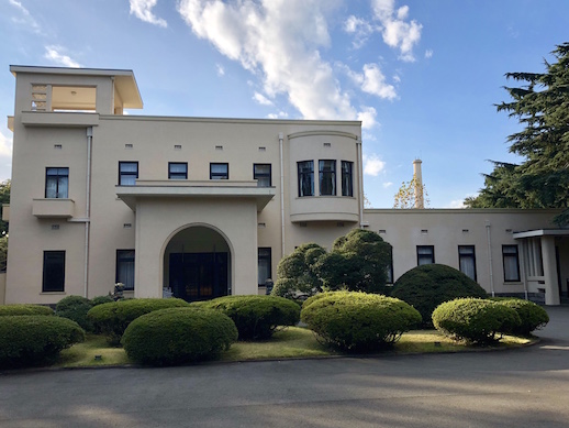
There are not many buildings in Tokyo that exemplify the Art Deco style, which, thus, makes the Tokyo Metropolitan Teien Art Museum in Shiroganedai a uniquely wonderful exception. The original building was home to Prince Yasuhiko Asaka (1887-1981), son-in-law of Emperor Meiji, from 1933 to 1947. The Prince and Princess were so captivated by the Paris exposition in 1925 that they commissioned French designer Henri Rapin and renowned Art Nouveau glass designer René Lalique to redesign the Asaka residence into an Art Deco showcase. In 1983, the residence finally opened publicly as a museum with its beautifully preserved Art Deco interiors, making it one of Tokyo’s most elegant architectural masterpieces.
It is, therefore, an appropriate occasion for the museum to launch an extensive exhibition on Constructivism, the revolutionary artistic movement of the early– to mid–1900s that spread largely across Europe, coinciding with the reconstruction period of the building before it was established as a museum. The exhibition “Constructive Posters of the 20th Century,” running until April 11th, presents approximately 130 posters from the Takeo Poster Collection, on deposit at Tama Art University, that represent the development of the Constructivism movement and the progressive changes it made in the creation of icons and texts for posters, graphic design, advertising, and commercial media throughout the 20th century.
Constructivism was said to have begun with Vladimir Tatlin, a Russian artist who conceived of an artistic movement that would respond to the social changes that had taken place during the Russian Revolution in 1917. He experimented with abstract, three-dimensional collages of metal and wood, and avoided aesthetic ornaments. The expression was intended to reflect the modern industrial world, and adopt technical applications and organization of materials. The style emphasized construction and science, rather than artistic expression; therefore, the approach was rather stoic, simple, and direct, utilizing solely the harmony of texts, particularly font design, singular objects, and defined colors, such as primary hues. Among the noted Constructive artists were El Lissitzky, Jan Tschichold, Max Bill, and Josef Müller-Brockmann, whose works are displayed in the exhibition.
The exhibition is divided into three sections on two floors and the Annex: 1. The Geometry of Iconography and Typography, which covers the Constructivist and International Style, widely taught by the Swiss School and the Ulm School; 2. Historic Dynamism, which illustrates the influences of Russian Constructivism, De Stijl, Bauhaus, and the New Typography; and 3. Whereabouts of Communication, which surmises rising trends since the 1970s, such as the New Wave and Postmodernism.
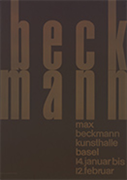
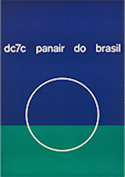
The International Style, which was first introduced around 1932, gathered artists, designers, and architects, especially from the Bauhaus movement, such as Walter Gropius, Marcel Breuer, Mies van der Rohe, and Le Corbuseir, who embodied visual tendencies that were rectilinear, asymmetrical, and undecorated; therefore, defining utter simplicity. In graphic design, it was often described as the “landscape of images and texts.” Posters on display by Emil Ruder, Max Beckmann (Kunsthalle Basel, 1956), an exhibition announcement, and Mary Vieira, DC7C Panair do Brasil (1957 ©Isisuf-Archivio Mary Vieira, Milano), a promotional advertisement, are samples of such clean and orthodox graphic designs of this era. Emil Ruder was a Swiss typographer, graphic designer, and educator at Basel School of Design. He was a major contributor of the Swiss Style, or the later-known International Style, and believed that typography’s purpose was to communicate ideas. Mary Vieira was a Brazilian sculptor, painter, teacher, space designer, and graphic designer who was invited to participate in the last exhibition of the Swiss Group Allianz by Max Bill, co-founder of the Ulm School and considered to be the most influential mover of Swiss graphic design. The two mentioned works of Emil and Mary both reveal plain, black backgrounds and unified fonts and colors. The exhibition features around seven of Max Bill’s works. His Die Farbe (Kunstgewerbermuseum Zurich, 1943, Switzerland), an exhibition announcement for The Arts and Crafts Museum of Zurich, strikes the viewer with the presence of red, yellow, blue, green, and purple colors, in contrast with the more popularized usage of a one-color theme.
The Ulm School of Design was a private school of industrial design and visual communication in Ulm, Germany that opened in 1953 and continued the Bauhaus ideologies. It promoted a minimalist text style that combined geometric forms and photographs, and employed simple printing techniques on paper and other materials. Otl Aicher, one of the founders of this design school, exhibits his posters depicting unusual colors, such as orange, violet, red, and blue in his event announcement Das 19 (Jahrhundert/Donnerstagvorträge im Januar-Februar), and one of his most famous posters, the pictograms for the 1972 Summer Olympics in Munich, which introduced the use of stick figures for public signage, Piktogramme (München 1972, Montreal 1976).
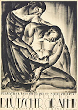
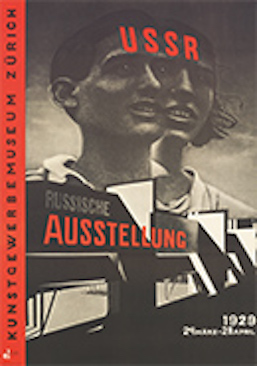
At the height of the Constructivist period, new developments in styles and fonts began to emerge. Sans-serif fonts were most typically used, and while the available large sizes were quite limited at that time, most designers had to perform hand lettering. El Lissitzky, an artist, designer, photographer, typographer, polemicist, and architect who greatly influenced Russian Constructivism, was a key figure of the Russian avant-garde, and largely created propaganda works for the Soviet Union. This is illustrated in USSR (Russische Ausstelung/Kustgewerbemuseum Zürich, 1929), an exhibition announcement designed with the Sans-serif font for the Russian Exhibition at The Arts and Crafts Museum of Zurich. Another revealing work is by Eugen Ehmann, Ausstellung Deutscher Graphik (Kunstsalon Wolfsberg Zürich, 1921), an exhibition announcement for the Art Salon Wolfsberg, Zurich, showing not only text over black and white or a colored background, but also a lithographic artwork of a man and a woman in a somewhat Cubist style.
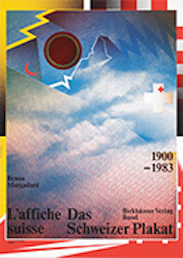
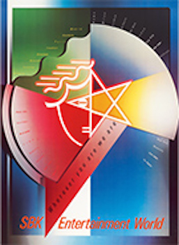
The Annex gallery is perhaps is the ultimate highlight of the exhibition. It displays a grand collection of about 59 colorful Constructivist posters. From the 1970s, the movement witnessed drastic changes, which transcended beyond texts and images to include an interplay of pictures, photographs, and artwork. The changes grew out of public consciousness towards Socialism and ignited objectivity in thoughts. Colors became bolder and more apparent. Desktop publishing arrived as a major graphic communication tool together with offset printing. Wolfgang Weingart’s Das Schweitzer Plakat 1900–1983 (Birkhäuser Verlag, 1983 © Wolfgang Weingart), or The Swiss Poster, a publication commercial, and Skolos-Wedell’s SBK Entertainment World, (c. 1987 © Skolos-Wedell), a promotional advertisement, both depict the radical development in Constructivism with the incorporation of colorful visual imagery and collage.
Wolfgang Weingart, internationally renowned graphic designer and typographer, was an educator at Basel School of Design. He collaborated with Emil Ruder, and is recognized as the father of the New Wave, or Swiss Punk typography. Graphic designer Nancy Skolos and photographer Thomas Wendell are a husband and wife team from the U.S. who explore material qualities on a two-dimensional space, combined with construction of images, symbols and words. In some ways, the design trend resembles features of the Memphis Style (1980-1987), founded by popular Italian designer Ettore Sottsass that was also characterized by abstract aesthetics and asymmetrical shapes and paved the road towards Post Modernism. One notable display on a table, Does It Make Sense? (Design Quarterly #133, Walker Art Center, Publication Commercial, 1986, USA) by graphic designer, artist, and educator April Greiman, is a long, two-meter offset lithograph of the designer’s full body seemingly caught in a dreamy worldview of herself as artist and author. She applies a technique of pixel aesthetics, and outlines a chronological timeline that traces the evolution of the electronic age.
Upon exiting the exhibition, you can step out into the picturesque European and Japanese gardens, and stop for a glimpse of the museum building’s exterior facade, while continuing to relish the artistry of both the Constructivist and Art Deco era that has immensely impacted design ideology today.
Alma Reyes
Alma Reyes
SHARE