Revisiting Revolutionary Roots
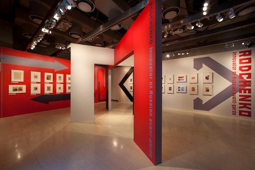
A leading figure in various Russian avant-garde circles, Aleksandr Rodchenko (1891-1956) is the star of Ginza Graphic Gallery’s latest show, “Innovator of the Russian Avant-Garde”, which presents his highly influential graphic design work from the Twenties and Thirties. Exhibiting alongside the Russian Futurists early on in his career in 1916, tenets of that movement are apparent in some of his works; the way in which graphics and text are prioritized in many of his pieces is particularly telling. However, as is obvious from looking at Rodchenko’s output, this continuity was limited, and there was a clear break with the past as he began to develop an original visual language by which he forged a new path in advance of the rapidly changing society he existed within.
Between 1915 and 1916 Rodchenko developed a system of abstract geometric creativity that drove many of his future artistic explorations. Though he is often overwhelmingly associated with Russian Constructivism, arguably one of the most influential avant-garde movements of the twentieth century, Rodchenko was a member of the Non-Objectivism group before that, and remained heavily committed to using minimal elements. Though, as the works currently on show demonstrate, by the Twenties he had moved away from depicting pure forms and towards a functional style often referred to as Productivism, which forms the context for many of the 150 or so works displayed.

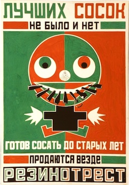
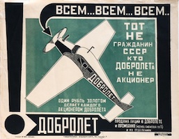
This Productivism closely relates to the Social Revolution of 1917 and the widespread appeal to construct a new world, rather than rebuild from ruins, in the wake of continued political and social change. For Rodchenko, “[t]he [sic] modern art [was] a conscious and well-organized life which [was] able to see and construct.”1 For him, graphic design was a way of sharing his art with the masses whilst actively helping them to envision their future. Featured in this exhibition are some of his most reproduced works, in the form of caramel wrapper designs, cookie boxes, book covers and advertising posters.

A fan of the clear linearity of ukiyoe woodblock prints by artists such as Hokusai and Utamaro, Rodchenko’s compositions are lead by both visible and invisible lines. His lines are not constrictive, however, for they connote directionality and space, adding a sense of movement to the deliberately flat plane. The esquisse for the cover of ‘Kamyen (The Stone)’ (1923) or the various works for ‘Mess Mend’ (1924) perfectly demonstrate this.
Another of the most innovative aspects of his work is the visual manifestation of text. It is not focused on in the exhibition, which lacks much in the way of explanatory text aside from a timeline, but many of the advertising works on show are collaborations with Vladmir Mayakovsky, a poet who authored much of the copy featured on the posters and packaging Rodchenko worked on. The two of them, who originally met at a Futurist meeting in Kazan in 1914, shared a joint office from 1923 and referred to themselves as “advertising constructors” in a collaboration that lasted for three years.

Developing a fervent interest in photography after 1924 once he procured his 9×12 camera, Rodchenko’s photographic innovation is also well documented in this exhibition. On show downstairs are a number of his iconic portraits of leading avant-gardists alongside striking non-figurative compositions. His use of foreshortening in order to produce extreme viewpoints was groundbreaking at the time. Comparably, the photomontages on the first floor relate to the new theorization of montage being explored in cinema by filmmakers such as Dziga Vertov, for whose documentary film Kinoglaz [Kino-eye] (1925) Rodchenko produced a poster.
Such innovations relating to limiting colors, exploration of bold text and linear composition, and foreshortening no longer sound all that impressive, but that is only because they have become so pervasive in all fields of visual culture in the developed world that it is almost impossible to see them afresh. This fact is a testament to their importance.
Downstairs there is a short film featuring Mr. Aleksandr Lavrentiev, the grandson of Rodchenko. He rather aptly comments on the influence of his grandfather’s style on younger artists. For him, the stylish poster advertising the exhibition itself, produced by Japanese artists, is a prime example of how Rodchenko’s innovative graphic style has provided inspiration for others. By using his pioneering approach to abstraction and the simplification of forms, Rodchenko was able to represent the essence of products, companies, the Russian avant-garde, and arguably an entire age. Indeed, this exhibition goes to great efforts to re-create this narrative and succeeds brilliantly.
Readers interested in the work of Aleksandr Rodchenko may wish to see TABlog’s review of the Aleksandr Rodchenko + Varvara Stepanova “Visions of Constructivism” exhibition at the Tokyo Metropolitan Teien Art Museum in 2010.
Jessica Jane Howard
Jessica Jane Howard


